Thursday, 25 January 2018

Hyper Lapse inspiration

It was Ollie's idea to include a hyper lapse after watching Rag'n'Bone mans Human music video. A hyper lapse is a technique in time-lapse photography that allows the photographer to create motion shots. in its simplest form, a hyper lapse is achieved by manually moving the camera a short distance between each shot and keeping the subject relatively in the middle of the frame. In the rag n bone man video they do this in a circle around a subject which is a person and when it comes back around there is a different Peron so Ollie's idea was to do this with Alex and Jade wont be in 1 of the spins then just Alex on his own in the next rotation.

The hyper lapse can be seen at 1:55 and stops at 2:04 in the video

this is the hyper lapse we used in our video, it doesn't look as good as there was no flat ground to do it on as it was in the forest unlike the human video but it still looks good and I'm impressed at how at turned out

Iconic album covers

Below is a list of the most iconic album covers 

The Beatles: Abbey Road
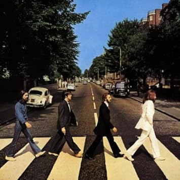
Image result for Abbey roadThis pristine shot of the band crossing the road in unison takes place just outside the EMI studios on abbey road. The photo has led many a fan to venture to the same spot in an attempt to recreate the short . although likely without the assistance of the stepladder and traffic cop halting traffic it took for photographer Iain Macmillan to accomplish.


The Beatles: Sgt. Pepper's lonely Hearts Club Band
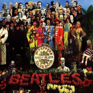
Image result for Sgt. Pepper's Lonely Hearts Club BandPerhaps the best known album cover of all time, The Beatles standing in front of a floral garden and donned in day-glo coloured suits, are surrounded by wax statues of themselves, cardboard cutouts of over seventy celebrities and a Shirley Temple doll in the right edge of the shot, wearing a Rolling Stones sweater. the famous shot is about as eye catching and detail rich as album art gets


David Bowie: Aladdin Sane
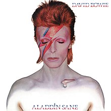
Image result for aladdin saneThe cover finds the father of glam rock shirtless, embracing his rock star status, with a red lightning bolt painted across his right eye. It was one of many Bowie covers to focus on his distinctively flamboyant look.


N.W.A.; Straight Outta Compton
Image result for straight outta comptonGreat covers can offer a sample of what to expect on the album. This view from a beat-down from the group on their 1988 debut does an excellent job setting the stage fro the lyrical ass whooping it contained.


Pink Floyd: Dark Side Of The Moon
Image result for pink floyd dark side of the moonOrdered to come up with something"smarter, neater-more classy" for the cover of their eighth studio album, the classic rockers settled on this prism design from George Hardie. Considering this is one of the most widely known images in all of rock, mission accomplished

Tuesday, 23 January 2018

Editing 3!!

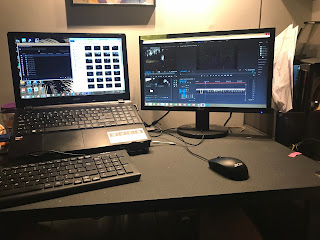
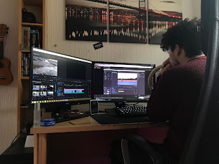
For the editing this time I edited the hyper lapse which was a very long process as there were 60 photos which all had to be imported in order and the size had to be changed to fit the size of the video, all the pictures imported as 5 seconds long so one they were all in order i had to select all of them change the duration to 0.5 seconds to fill in the gap we needed , after doing this the clips became hardly visible unless you zoomed in, instead of moving every clip by themselves I looked at some tutorials and learnt the fast way of removing the gap, I had to add a colour matte layer drag the clips on top drag them back of select the colour matte layer again right click and click delete ripple which brought all the photos together with no gaps. this has aided my premiere skills as I can teach other people to make hyper lapse the easier way and will help me in the future.

Monday, 22 January 2018

Filming day 7


This was the last time we need to go out filming on location, sadly I wasn't able to make it as i had a fracture clinic appointment but finally had my cast off which is a shame that all of the filming is done now. But after seeing what footage the team had come back with i was very impressed and they filmed everything that needed to be filmed. Ollie also had the idea of using a hyper lapse in the video which when edited it should look really good.


Saturday, 20 January 2018

Editing 2!

Me and Ollie spent 2/3 hours editing which has given us a really good understanding of what we have left to film so we can put it into the edit and hopefully complete the edit. When we realised we had finished the editing with the clips that we had, we thought it would be best to play around with the title as it looked very boring to start with as it was plane white writing that faded in and out of frame but we wanted something more interesting and professional so we accidentally me across the graphics menu on Adobe Premiere Pro and we found a very good template we decided to use, but we need to discuss it with the rest of the group as we think it doesn't fit the mood of the video.

via GIPHY
This is the intro me and Ollie produced
So as our draft was rendering and exporting we took the time to go through the lyrics and write down ideas we could put in place to complete the video, we made this so we had a clear understanding and also so we wouldn't forget so we wouldn't have to go out filming again.


Friday, 19 January 2018

1st Draft with lyrics


This is the first edit of our video with the lyrics on, the clip is very little because of the long process it takes to make the animation for the lyrics so this is how far we've got with that

The major thing we need to fix is the lyrics going on top of the black border which can be easily fixed

1st draft without lyrics


This is the first edit we have without the lyrics, this version is longer than the lyrics version as we had more time to focus on the footage. we are all happy with this as a first draft.

we all like how the shots are effective and fit the lyrics, we feel that the relationship is easily established within the 1st draft. the two contrasting feelings and emotions are shown through the juxtaposing shots of Jade and Alex then Alex on his own, this fits in with the juxtaposing lyrics

there is still more to be improved though, getting more footage is definetley a big part for us to be capable for filling the song. the typography at the start needs to be changed

Wednesday, 17 January 2018

Filming day 6


After not being able to go out filming for the past 3 times i finally went out and filmed, after going back to fracture clinic and telling me i dint really need to use crutches, i wanted to get out there as it felt like I hadn't really contributed towards the group and let them down by not being available. I had no problem with my cast when climbing across the rocks but i had to be extremely careful that I didn't slip and injure myself even more. The photos were taken by Josh as everyone else was busy, me and Ollie both have the same camera now which has assisted our quantity of our work.


Tuesday, 16 January 2018

Contingency plan 2

Related imageAs seen in my last post we used the colleges facility to edit our video, as our sixth form is linked with the local college. We did the same last year and it helped so much and raised the quality of our work. however at the start of this week we've been told we are unable to use these facilities for health and safety reasons. Now we have to find a way to edit on Premiere pro 2017 as that's what we've been editing our video and have got really used to the software.

Editing!

Today we went down the college like last year to edit, as they have much better editing software and there is no cost for us. i did most of the video whilst Ollie did the lyrics to put over the video, whilst Alex and Josh worked on their dijipak products


Monday, 15 January 2018

Filming day 5


On this filming day we were shooting in the indoor location of Ollie's house as its the closest school and easiest to access in the day. Sadly I wasn't there again for this day as it was filmed in a free lesson and I had a lesson but told them to carry on because the quicker it gets done the better. 

Magazine adverts

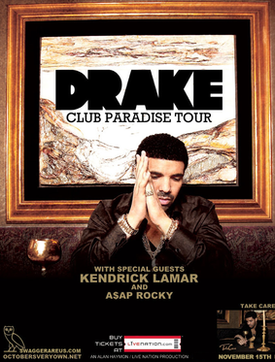
Image result for drake club paradise tourThis magazine advert was for Drakes new tour when he released his new album.This advert contains the codes and conventions as it tells you where to buy tickets for the tour, it also contains the album cover in the corner. It also promotes it by including special guests which would attract more attention. This magazine cover is very similar to his album cover as it features Drake in an old fashioned setting with the picture frame.


This is also another good example of a magazine advert as it clearly shows all the vital details to the target market whilst also being very aesthetically pleasing and suiting the style of music genre that Wretch 32 would come under. It also includes all of the shops and retailers that would be selling the album in the bottom left.


Digipak planning

Image result for digipak templateImage result for digipak template
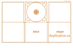
These are the different templates for the digipaks with the different number of sides. For my digipak im thinking of using a 6 panel pak and want to include a panoramic photo of jade and alex looking at eachother and their faces would be on different panles so when you open it up it reveales them looking at eachother with the beach in the background so it relates to out video.

Basic Digipak research

Digipak is a patented style of optical disc packaging. Digipaks typically consist of a gatefold paperboard or card stock outer binding, with one ore more plastic trays capable of holding CD or DVD attatched to the inside.
Digipaks style packaging are often used for CD singles or special editions of CD albums. Digipaks style cases grew in popularityu among record labels and recording artisits in the early 2000's

Image result for digipak


This is an example of a 4 panel digipak. The 4 panels consist of the front, the back, the inside of the front which sometimes consist of the lyrics, then the panel which consist of the CD nornally in a plactic casing which you pop the CD out of a card sleeve.


This is a 6 panel digipak. It has extra panels to explain more about the artsist and the song whilst doing the same as the 4 panel digipak they are as equally as popular.