The front cover is a picture of alex with a simple blue overlay with another layer applied so i could make the paintbrush stroke stand out infront of alex.
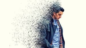
 When you open the digipak the next panel you would see is the one on the bottom left, this effect is called a disperison effect, and is supposed to look like the photo to the right.
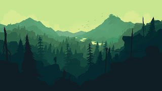
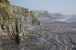
 The inside of the dijipak is Flat landscape image of the southerndown cliffs where we filmed the majority of the video. To learn how to do this is watched a youtube tutorial and i now know how to produce one with little guidance. The image is traced around for the most accurate results ws the one below .
I had to download the font of the internet as I felt is was the best one that would suit my theme. I also had to download bruhses of the internet for photoshop as there were no presets on photoshop.

No comments:
Post a Comment