
Tuesday, 20 February 2018
Magazine advert
Monday, 19 February 2018
Magazine advert 1st draft


Friday, 16 February 2018
How I made the dijipak

The front cover is a picture of alex with a simple blue overlay with another layer applied so i could make the paintbrush stroke stand out infront of alex.
 When you open the digipak the next panel you would see is the one on the bottom left, this effect is called a disperison effect, and is supposed to look like the photo to the right.
 The inside of the dijipak is Flat landscape image of the southerndown cliffs where we filmed the majority of the video. To learn how to do this is watched a youtube tutorial and i now know how to produce one with little guidance. The image is traced around for the most accurate results ws the one below .
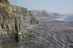
I had to download the font of the internet as I felt is was the best one that would suit my theme. I also had to download bruhses of the internet for photoshop as there were no presets on photoshop.

Thursday, 15 February 2018

Magazine adverts that have influenced my product
this magazine advert has influenced where I position certain conventions on my product for example on my product the position of the album is in the bottom left corner like the magazine advert below> This advert has also influenced the music record company that i am going to include, on this product they have used very modern company to add, on my product i have also done the same

Exsiting digipaks that influenced mine

This digipak gave me a very good skill to use, as you can see i've circled that the information about the digipak is included in the birds shape. Most digipaks include some infortmation about the artisit, the digipak. I have included this in my digipak as I think it makes the audience have a more relateble experience and a better understanding of the songs. I have used the same skill in my digipak by including the information inside the flat lanscapes I made on photo shop as it made it stand out and look more interesting.
 I like this Dijipak as the pictures of the lanscape flows as 1 image, I think this is a technique that it is effective as it gives the customer an idea for the enviroment the artist feels comfortable in

Digipak photos
Here are the photos that I plan to use for my Dijipak
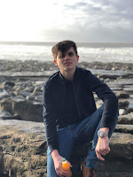
 I took this picture myself with a Canon 700D on the last filming day, i really like this picture because the glare of the sun adds a silhouette effect on Alex. I'm going to use this for my front cover
With this photo of Alex i can put in the inside panel after the front cover, i can do some research to some effects to add which will make this image stand out
 I created this image myself on Photoshop, after watching a YouTube tutorial i found it very easy to create. i will use this on the inside panels and spread it across all 3 panels so it will be effective


With this photo of Alex i can put in the inside panel after the front cover, i can do some research to some effects to add which will make this image stand out

Thursday, 1 February 2018
Digipak 1st draft

Subscribe to:
Comments (Atom)